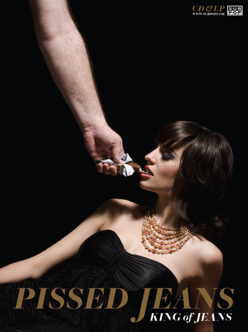
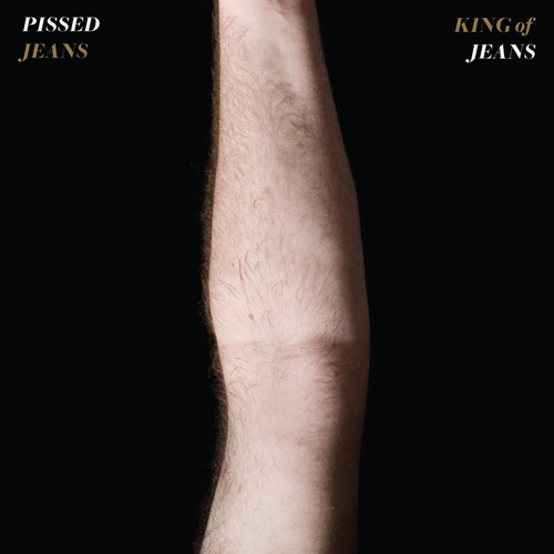
Planted in the center of the album cover for Pissed Jeans‘ latest LP, King of Jeans (Sub Pop), is a hairy, pasty arm, cropped at the wrist and bicep, slightly bent. But the arm is more than it appears: Opening the sleeve reveals the entire Smell the Glove-ish scene (shown above). It’s a great cover. Even better after we realized that Shawn Brackbill, one of regular contributing photographers, shot all the album art–and even more nuts when we realized that the record’s innards contained an image that originally appeared on this very dot-com. Yep, it’s our 15 minutes. But we’ll happily share the spotlight with Shawn (guess he’s earned it, after all). Here the photographer–who recently shot a video and the new LP cover for Cale Parks as well as a pair of 7-inch sleeves for Paint It Black–preps to tackle NYC Fashion Week by answering a few of our questions regarding the record sleeve’s caramel-y goodness.
self-titled: How long have you been working for Sub Pop? What press photos/album art have you done for them prior to Pissed Jeans?
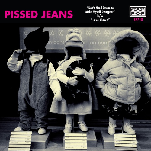
The first thing that I had done with Sub Pop was the cover of the second Pissed Jeans 7-inch (see below). They used a photo that I had shot in Paris of the window of a Baby Gap store. Since then, I have worked on Pissed Jeans and Mudhoney as well as shooting the SP20 festival for them.
Did you know the Pissed Jeans guys from your time living in Philly?
I actually met most of the band before living in Philadelphia and, I believe, before the Jeans were a band. I met [singer] Matt [Korvette] a few times when I was shopping at Double Decker Records in Allentown, Pennsylvania. I knew [drummer] Sean [McGuinness] thru my many trips to D.C. with Q And Not U.
Do you remember your first Pissed Jeans show?
I think my first was one at Jeff the Pigeon, a legendary Allentown show space. They played with Air Conditioning and Pearls and Brass, [bassist] Randy [Huth’s] band before he joined the Jeans. It was P and B’s record-release show for their Drag City LP [2006’s The Indian Tower].
How many shows have you seen since?
I’d say I’m approaching or just passed the 10-show mark.
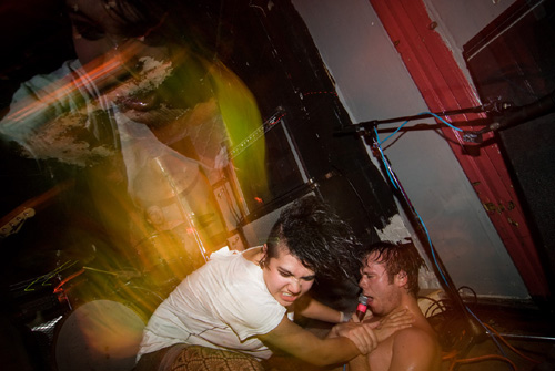
Why the decision to use the live shot in the liner notes portion of the new album? To show people just how nuts their shows can be?
I think so. That photo, which was posted on self-titled last September, was just one of those classic live shots that we felt really summed up just how crazy their shows can be. I’m always trying to capture a live performance without just showing a singer screaming into a mic. I thought this definitely had more depth than that. I’d like to give credit to Dusty Summers, a graphic designer from Sub Pop. He put the artwork together into the perfect package for the record. Outside it is classy and then you are hit with the contrasting live photo inside.
Where was that shot? That girl looks pretty goddamn insane. Did she back off Matt soon after you caught that photo? Was that show one of the crazier ones you’ve seen by them in terms of the crowd reaction?
That show was at Market Hotel, though I think the next show that I saw them play there-with Vivian Girls and Fucked Up-was a bit more active. Pissed Jeans played second, and it seemed like there was a stage diving competition or something. People were on the stage the entire set. The crowd wouldn’t let the Jeans off the stage without playing an encore, which is almost unheard of for opening bands. Something about the vibe of the show that the photo was from was crazy. Not sure what the story was with that girl. She jumped up on the stage and attacked Matt. That ghosting of her face really big is from her running towards the camera and jumping off the stage.
What’s the inspiration behind the King of Jeans cover art? The first thing someone said to me when they saw it was, “That’s a great cover photo, but do they realize how misogynistic it is?”
Well, I’m not exactly sure what the inspiration was. Matt came to me with the concept. At first I thought it was pretty hilarious, but the more I thought about it, I felt the same way . We made it a goal for the shoot that Emily, the model, have a glamorous look. I wanted her to be well dressed and classy. To have her look dignified. We also wanted to make sure that the eating of the candy bar be very tame-to try to strip away any sexual overtones.
How did you find your cover models? What kind of instructions did you give them?
We found the models through friends in Philadelphia. They were both great to work with. Emily came and was super psyched about it and brought a bunch of dresses with her. The trickiest part of the shoot was getting the spacing just right of the arm in the frame, Emily in the right pose, and just the right candy bar position and caramel stretch. We got everything just right in the one photo we used.
What kind of candy is Emily eating?
Well, after a few candy tests, we decided that the 3 Musketeers wrapper looked the best, but we liked the caramel of a Milky Way. So we put a Milky Way in a 3 Musketeers wrapper.
Finally, what’s one old and new (from the past year) record sleeve you really love?
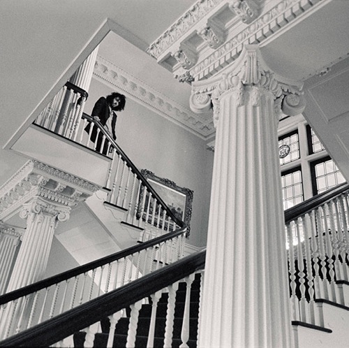
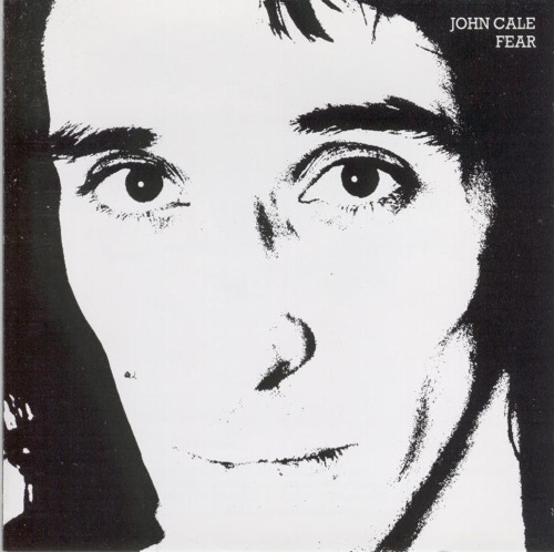
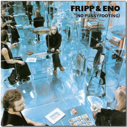
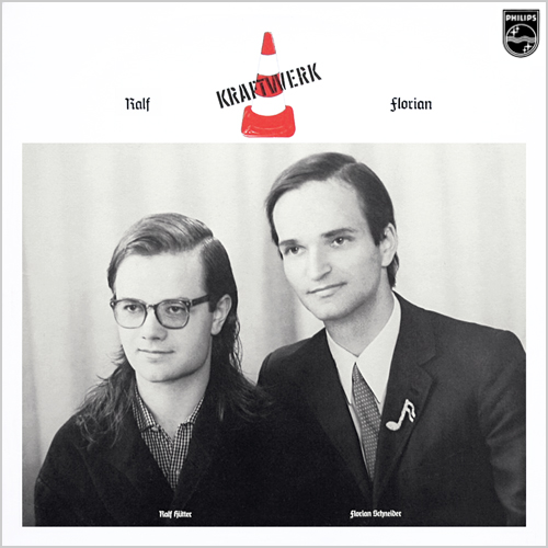
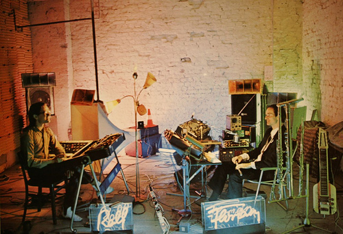
I was really impressed by the cover art of the newest Destroyer single. Not sure if it’s out yet, but it reminds me a bit of the back cover to John Cale’s Fear LP. As far as older covers, I’ve always loved the cover of the original gatefold version of the Fripp & Eno (No Pussyfooting) LP. Also love both images on the Kraftwerk Ralf und Florian LP. Classic!
[Destroyer’s Bay of Pigs EP]
[John Cale’s Fear]
[Fripp & Eno’s (No Pussyfooting)]
[Kraftwerk’s Ralf Und Florian (front cover)]
[Kraftwerk’s Ralf Und Florian (back cover image)]
